An advertising campaign for Toyota FJ Cruiser.
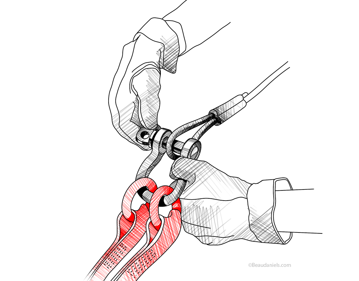
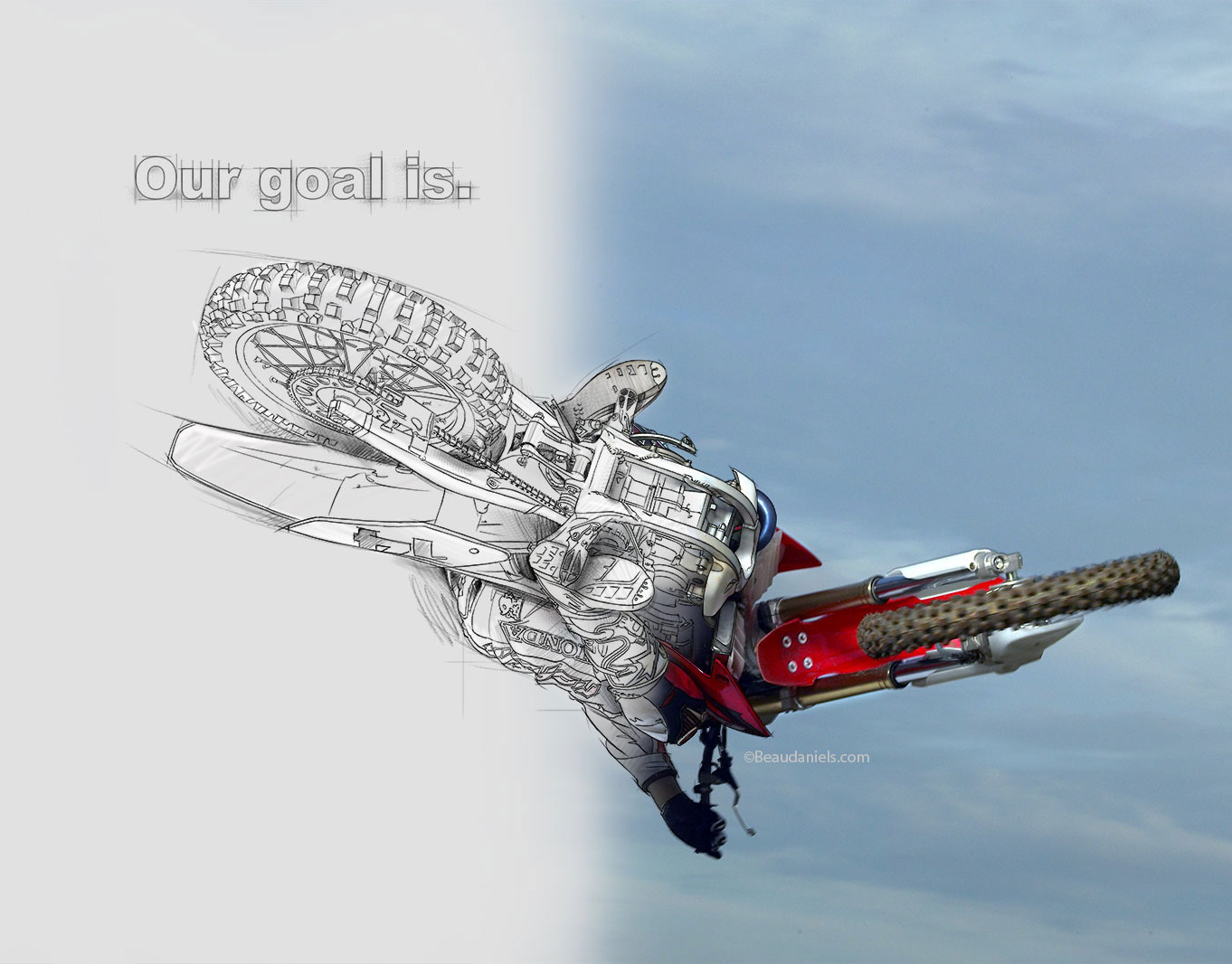
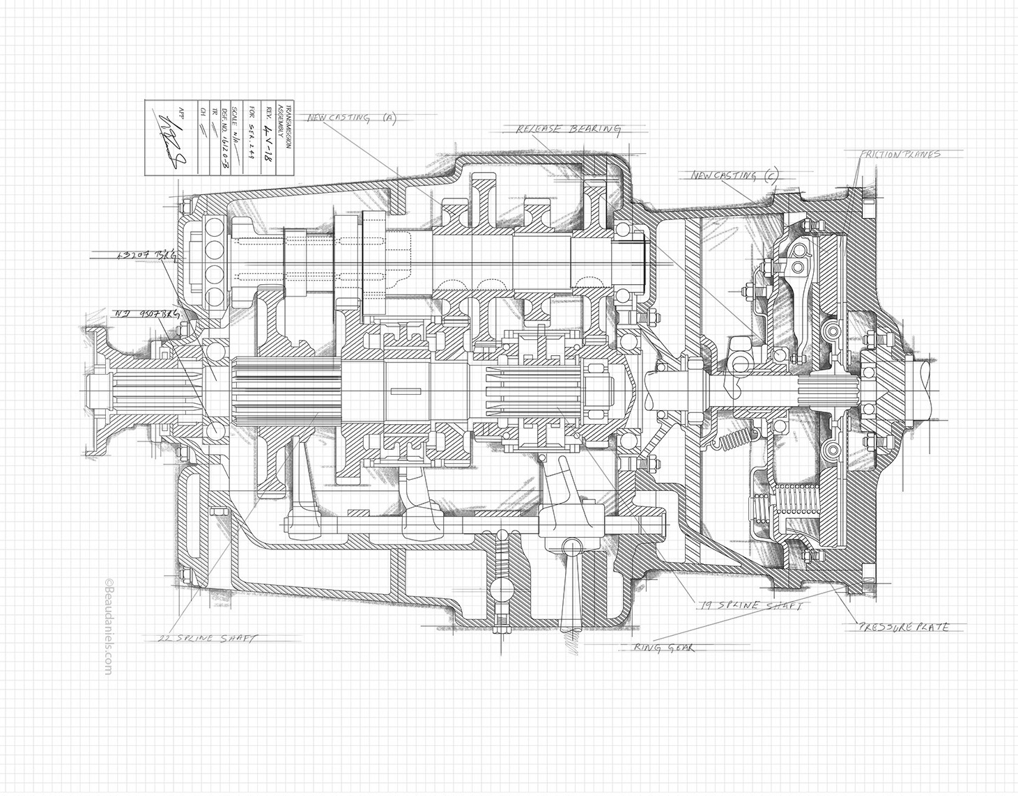
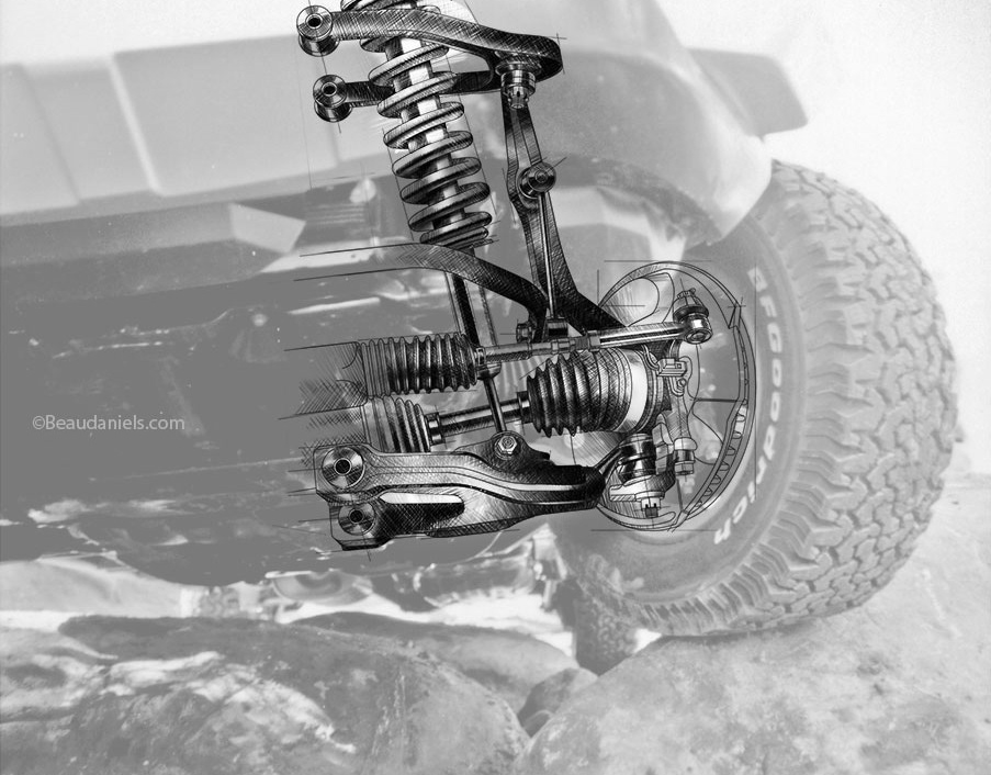
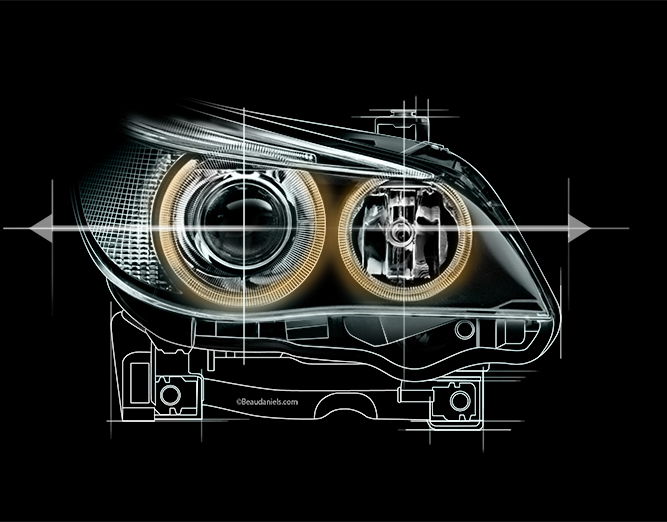
The directive was to create drawings that looked “old school” like the technical how to manuals. They had to look hand drawn, pen ink and pencil without any slick look to the images. At first because we work digitally the agency had a problem that we might not be able to create digitally what had to look like it was ink on paper. We convinced them that we could. The results are below.
FJ Cruiser Ads. All dangling parts left unattended will be torn off and left for dead.
FJ Cruiser Ads. Technical illustration and diagrams explaining the front suspension of a Toyota FJ Cruiser.
FJ Cruiser Ads. Rear suspension technical illustration, Toyota FJ Cruiser.
FJ Cruiser Ads. Water fording.
FJ Cruiser Ads. Exploded style technical illustration of a Toyota FJ cruiser 5-speed automatic transmission.FJ Cruiser Ads.
FJ Cruiser Ads. Cutaway style technical illustration of a Toyota FJ cruiser 6-speed transmission.
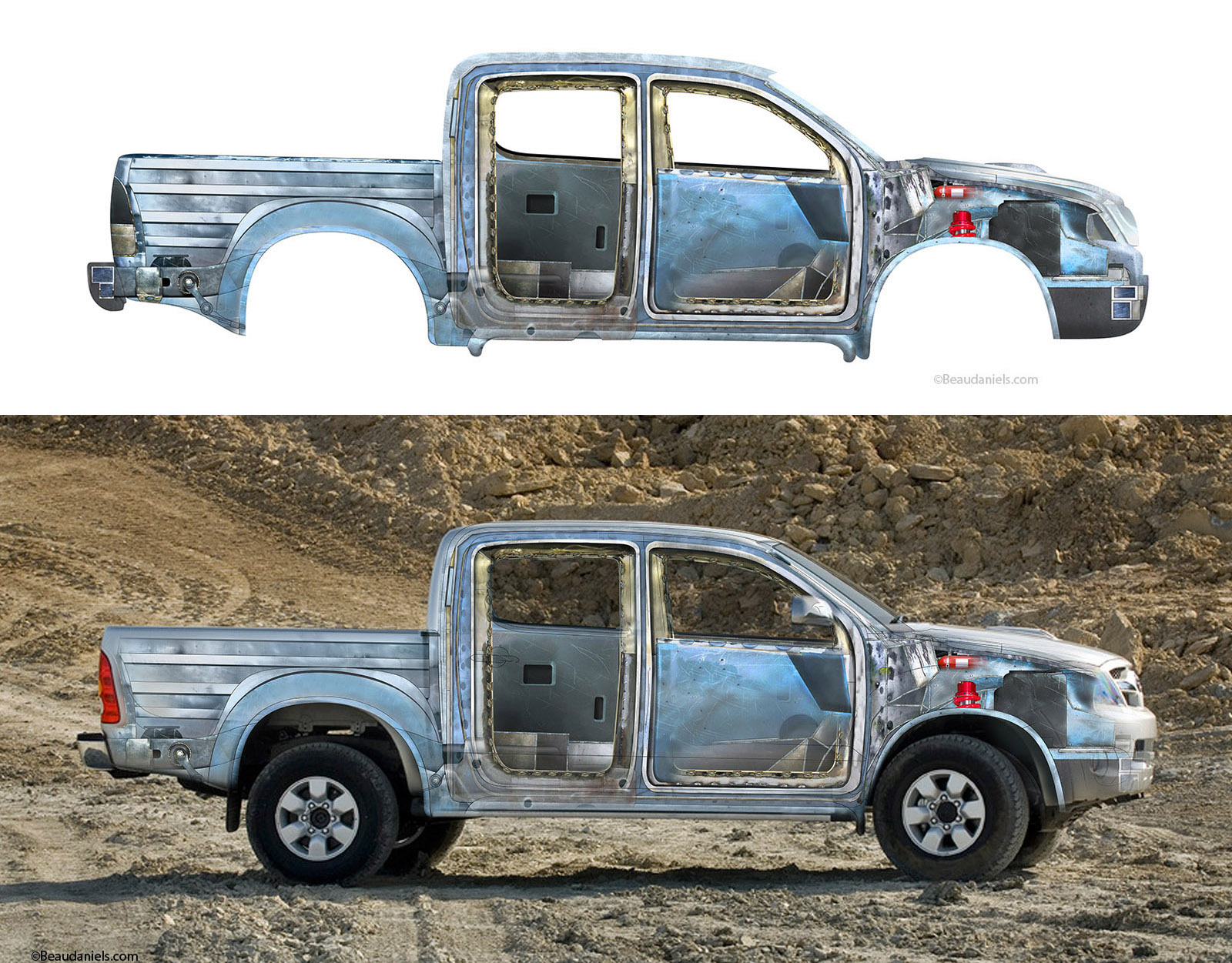
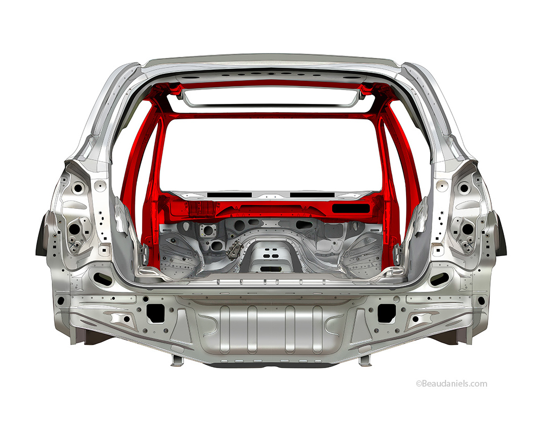
FJ Cruiser Ads. Exploded illustrations of the body of a Toyota FJ Cruiser.
FJ Cruiser Ads. Technical drawing of the ladder frame on a Toyota FJ Cruiser.
FJ Cruiser Ads. Technical illustrations to explain the locking differential on an FJ Cruiser.
FJ Cruiser Ads. Active traction control.
FJ Cruiser Ads. Carpet is for your living room not your truck.
An advertising campaign for Toyota FJ Cruiser. The directive was to create drawings that looked “old school” like the technical how to manuals. They had to look hand drawn, pen ink and pencil without any slick look to the images. At first because we work digitally the agency had a problem that we might not be able to create digitally what had to look like it was ink on paper. We convinced them that we could. The results are here. http://www.beaudaniels-illustration.com/automobileillustration/toyota.html
